DGK Skateboard Series
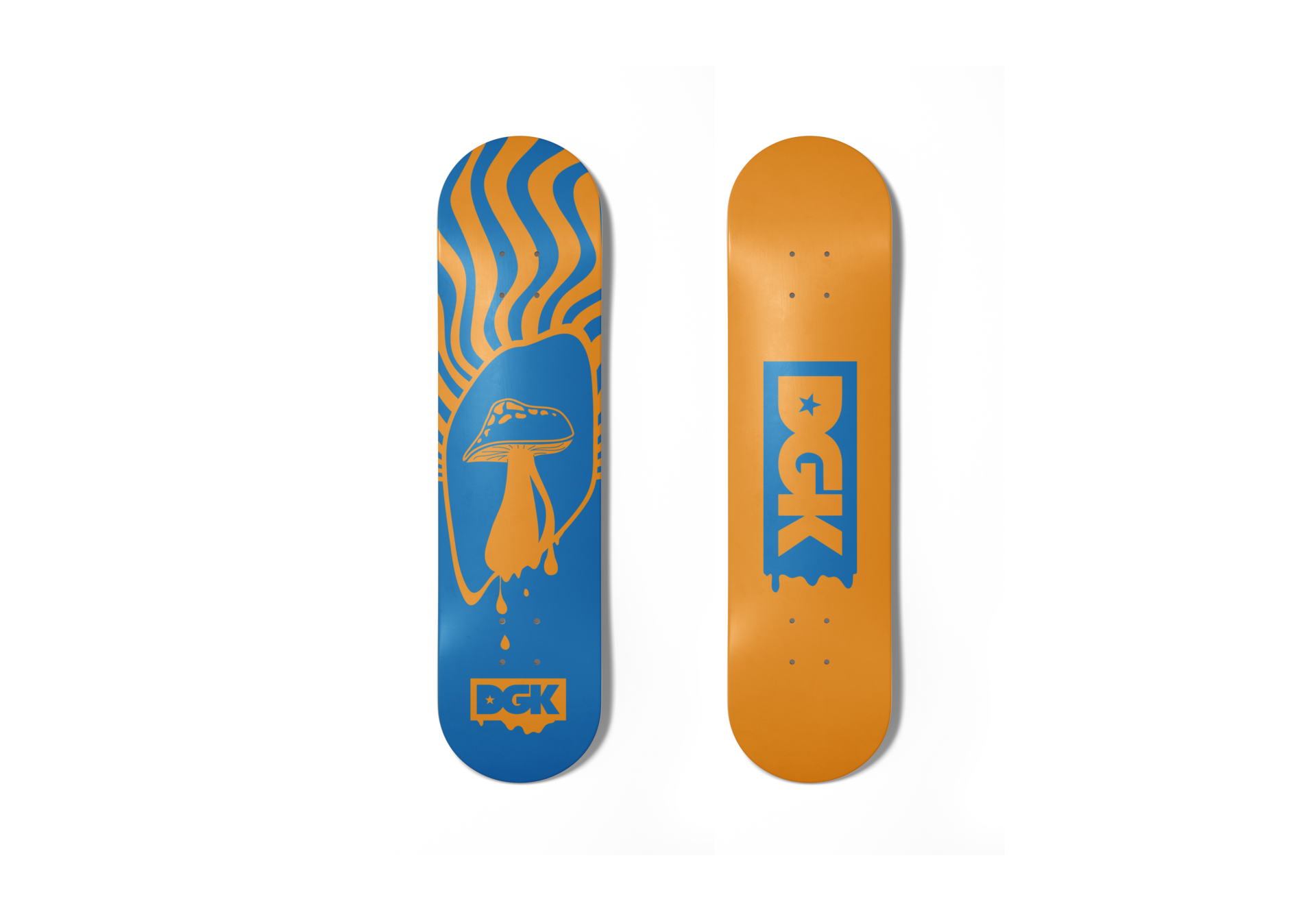
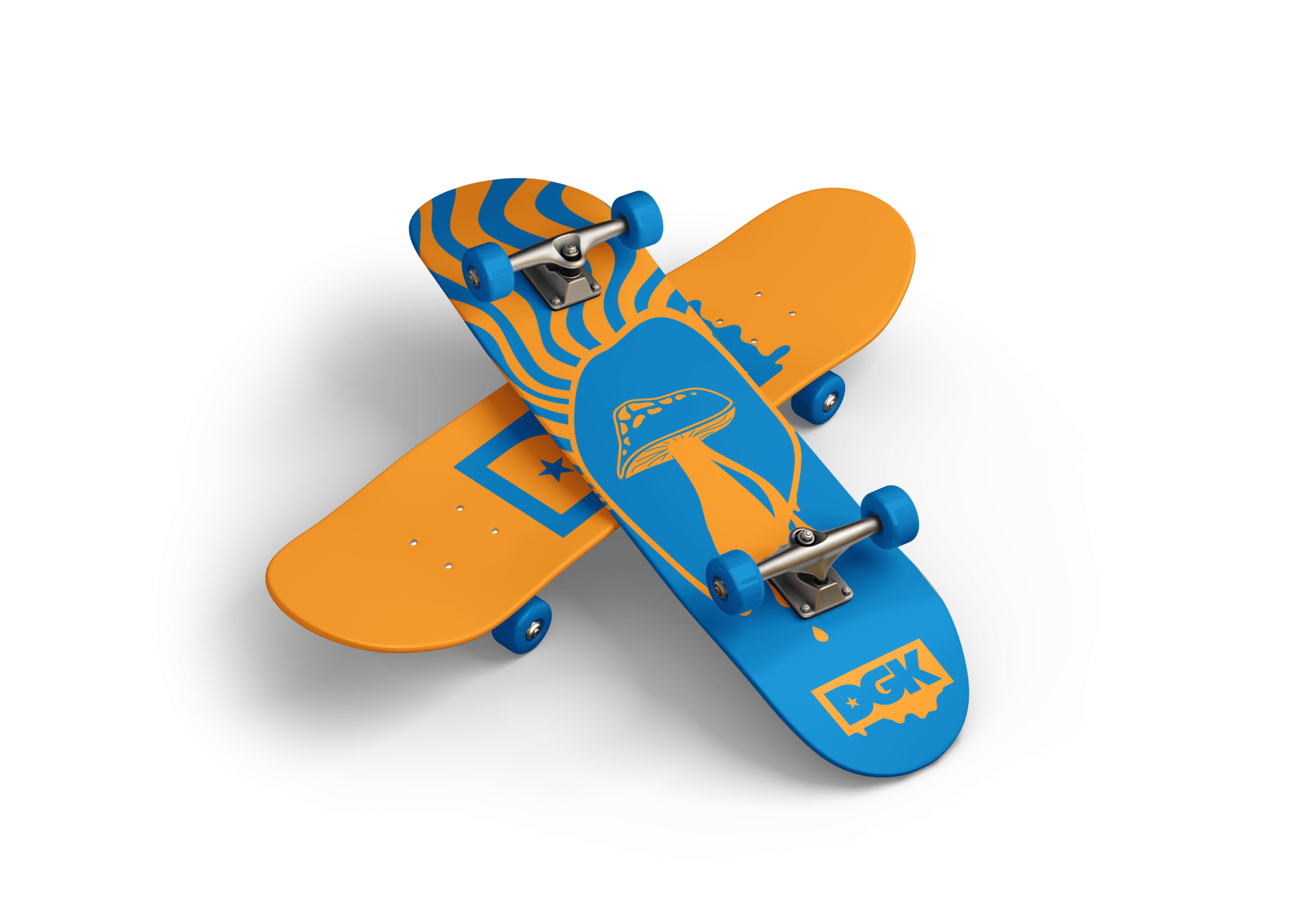
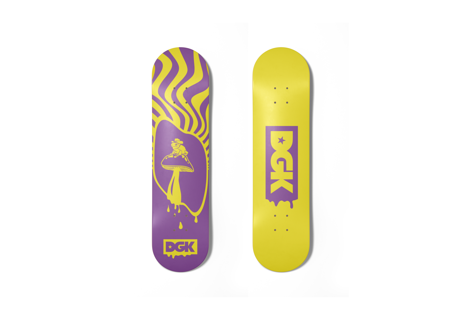
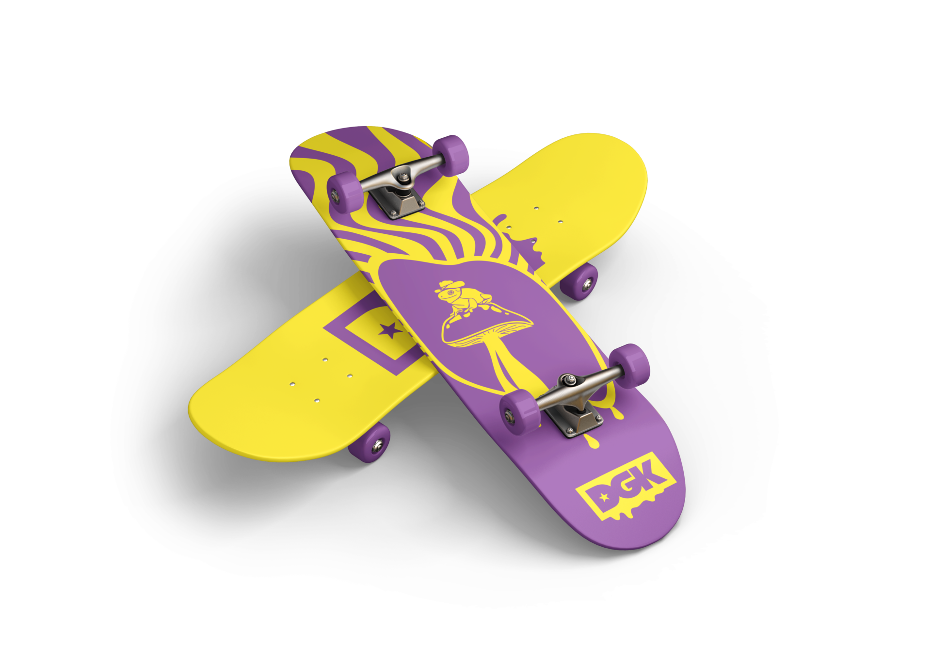
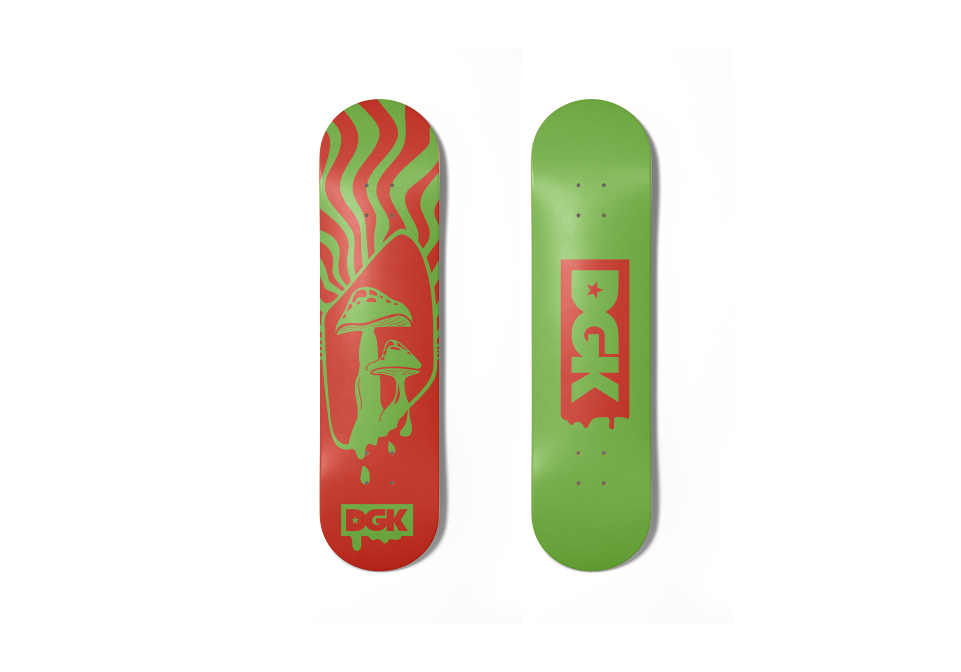
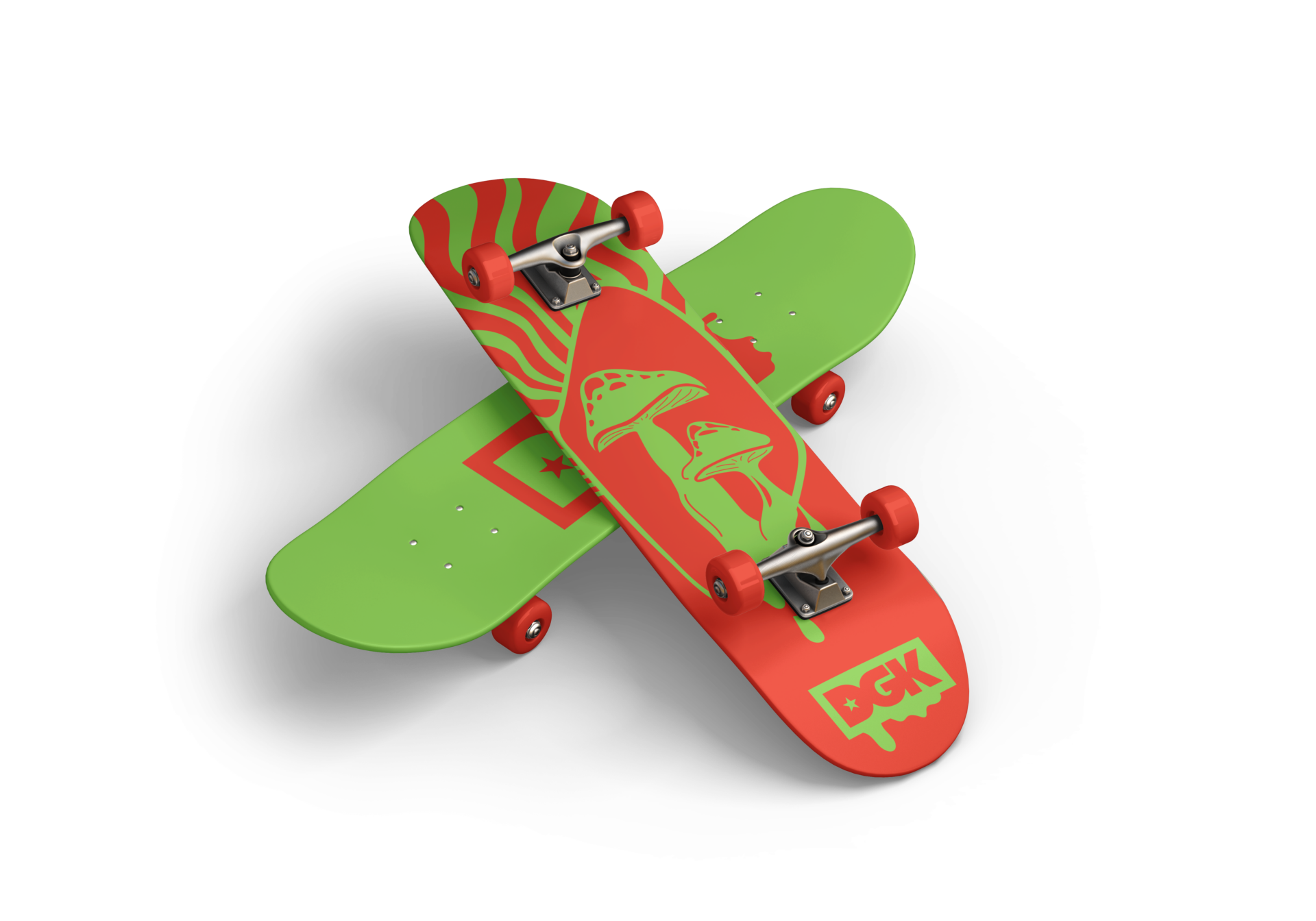
For this assignment, students had to create a series of skateboard deck designs for an existing skateboard brand. The new designs needed to take the existing brand into consideration in order to ensure cohesion. I created a bold, high contrast, psychedelic-inspired design using complimentary colours and mushrooms as the focal element.
Role: Graphic Designer & Original Illustrations (Adobe Illustrator)
Client: DGK Skateboards (Mock Project- Humber College)
About this Design
DGK’s brand and skateboard deck art is playful and heavily influenced by graffiti art and psychedelic design. The main commonalities I noticed between all deck designs is the ‘maximalist’ bold design style and use of bright highly saturated colours.
For this deck series, a bright and bold complimentary colour palette is used to fit with the existing brand’s decks while offering a new colour combination. The use of two different complimentary colours on each deck allows the decks to stand out individually but tie together as a series through intentional design elements. I pulled inspiration from the brand’s psychedelic designs through the use of a wavy sunburst, dripping elements, and a unique mushroom design for each deck. The cowboy frog element on the purple and yellow deck ties in the fun and playful identity of the brand’s designs. Finally, the logo is tied into the series with the addition of drips on both the top and bottom of the decks.


All mockups from www.freepik.com, logo from dgk.com